
Boost Engagement with Smart Demo Zone Graphics
In a world where brands are constantly competing for attention, creating the right impression in a product demonstration zone is crucial. Whether you are showcasing a new technology, a cosmetic range, or a cutting-edge gadget, how your zone looks will have a big impact on how your product is perceived. Strong, well-thought-out exhibition graphics can transform a standard demo area into a place that excites, engages, and converts visitors into customers.
In this blog, we will explore how to design graphics that truly enhance your product demonstration zones and leave a lasting impression.
Why Graphics Are Critical in Demonstration Areas
In busy exhibition halls and trade shows, you often have just a few seconds to capture someone's attention. This is where great graphics come into play.
First, graphics attract. A visually striking demonstration area will pull people in from across the room. Good graphics make a difference between visitors walking past or stopping to learn more about your brand.
Second, graphics communicate. Not everyone will have time to stay for a full demonstration, so your visuals must tell your brand story quickly. Whether it’s through powerful images, punchy headlines, or bold branding, graphics can communicate your value even when you are not speaking directly to someone.
Third, graphics reinforce the experience. During the live demonstration, supporting graphics can help highlight key features, benefits, and statistics that enhance the understanding of your product. Strong visual design makes it easier for visitors to remember what they saw.

Planning Your Graphics Around the Demo Journey
Designing your demonstration area should start with understanding the customer journey. You want visitors to flow naturally from curiosity to engagement to interaction.
- Understand the flow: Start by thinking about how people will enter and move through your demonstration area. Are you expecting them to walk around freely or follow a guided path? Mapping this out helps you position graphics strategically.
- Identify key touchpoints: Your graphics should support each stage of the customer journey — from grabbing attention at a distance, to providing more detail up close, to reinforcing key points during the demo itself.
- Ensure consistency: Every piece of your exhibition graphics, from backdrops to floor stickers, should feel part of the same family. This means consistent use of brand colours, fonts, logo positioning, and tone of voice.
Careful planning ensures your graphics are not just attractive, but work hard to guide and inform visitors too. Opting for bespoke exhibition stands allows you to tailor every graphic element precisely to your product, space, and brand, making a bigger impact.
Key Graphic Elements to Focus On
When it comes to creating the right visual environment, certain elements make a particularly big impact. Let’s look at the areas you should focus on:
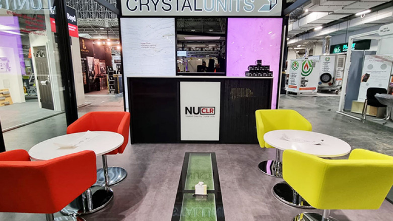
Backdrops and Walls
Large-scale backdrops are often the first thing visitors see. These should be bold, clean, and focused. A simple design with a strong headline and a powerful image often works best. Too much text will overwhelm visitors. Think about using your backdrop to frame your demonstration zone and create a professional, inviting space.
Floor Graphics
Floor graphics are a smart way to guide visitors subtly through your space. Arrows, footprints, or patterned walkways can lead people towards key stations or highlight areas of interest. Well-designed floor graphics can also make your demo zone feel more immersive and engaging.
Product Callouts
Simple signage or graphics that highlight the unique selling points of your product are important. Use infographics, bullet points, or icons to make information easy to absorb at a glance. Place these near the product being demonstrated so visitors can connect the messaging with the experience.
Live Data Displays or Animated Content
Adding movement can dramatically increase engagement. If appropriate, integrate screens showing product demonstrations, live statistics, or animated explainer videos. Digital graphics can make your stand feel cutting-edge and dynamic.
When designing all these elements, it’s important to remember basic design principles:
- Avoid clutter
- Use high contrast between text and background
- Create a clear visual hierarchy to guide the eye from the most important to the least important information
If your graphics are clean, clear, and well-organised, they will do much of the talking for you.
Materials and Printing Considerations
Choosing the right materials for your graphics is just as important as the design itself, especially in busy product demonstration zones.
Durability
Demonstration zones often see heavy footfall. You need materials that can withstand crowds without looking worn or damaged by the end of the event. Vinyl, Foamex boards, and rigid panels are strong choices for walls, backdrops, and signage.
Finish and Quality
Glossy finishes can sometimes create unwanted glare under strong exhibition lighting. A matt or satin finish often looks more professional and ensures your graphics are easy to read from any angle.
Modular Graphics
If you attend multiple events, modular graphics are a smart investment. Modular panels are easy to update, rearrange, and reuse, helping you save money over time without sacrificing the visual quality of your stand.
Choosing the right materials ensures your graphics look impressive, not just on day one, but throughout the entire event.

Common Mistakes to Avoid
Even with the best intentions, it’s easy to make mistakes when designing exhibition graphics for product demonstration zones. Here are a few to watch out for:
- Overloading graphics with too much text. Visitors should be able to understand your key message in seconds, not minutes.
- Poor placement that disrupts flow. Avoid putting large signs in places that block access or cause bottlenecks.
- Inconsistent branding. A mismatch in colours, logos, or fonts across different graphics can look unprofessional.
- Low-resolution images. Pixelated or blurry images instantly damage the perceived quality of your brand.
Taking the time to plan carefully and invest in high-quality graphics pays off with a much more polished and effective demonstration area.
Conclusion
Designing impactful graphics for product demonstration zones goes beyond good looks—it’s about guiding visitors, reinforcing messages, and creating memorable experiences. Strategic placement, clean design, quality materials, and brand consistency can transform a basic space into a powerful sales tool. Every detail should support your objectives and encourage engagement. Whether you're showcasing new products or explaining complex services, the right graphics can elevate your impact. Planning a new event? Expert support with exhibition graphics or bespoke exhibition stands can make all the difference. Sign Company London delivers tailored, professional solutions that help your demonstration zone stand out and drive real results.


Comments
0 comment